The Visual Display of Quantitative Information
The Visual Display of Quantitative Information by Edward Tufte is a seminal text in the field of data visualization. On page 40, the text walks the reader through the complexity of a graphic by Charles Minard1 that depicts Napoleon’s disastrous military campaign in Russia. An excerpt from that chapter is printed below, with permission2.
Narrative Graphics of Space and Time
An especially effective device for enhancing the explanatory power of time-series displays is to add spatial dimensions to the design of the graphic, so that the data are moving over space (in two or three dimensions) as well as over time. Three excellent space-time-story graphics illustrate here how multivariate complexity can be subtly integrated into graphical architecture, integrated so gently and unobtrusively that viewers are hardly aware that they are looking into a world of four or five dimensions. Occasionally graphics are belligerently multivariate, advertising the technique rather than the data. But not these three.
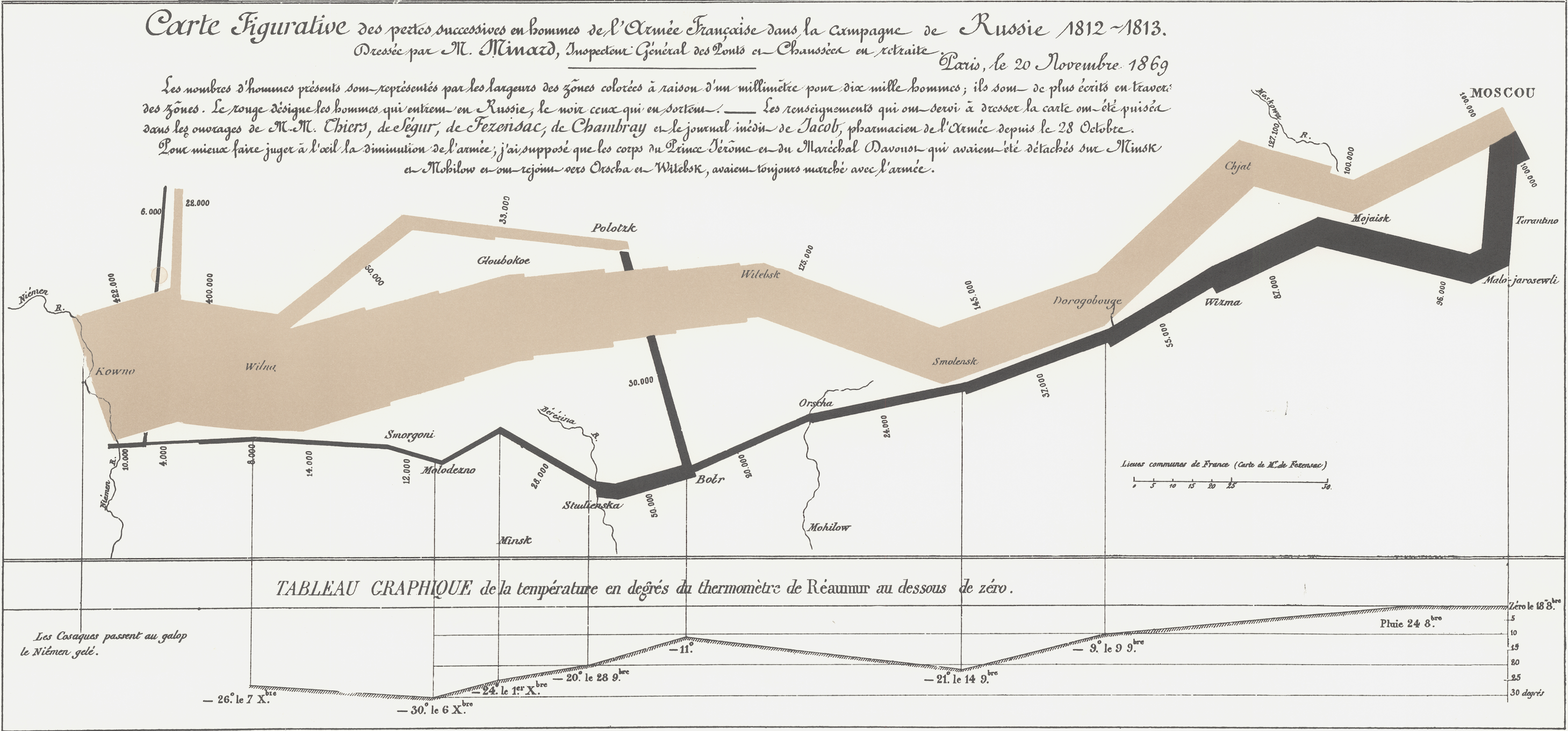
The first is the classic of Charles Joseph Minard (1781-1870), the French engineer, which shows the terrible fate of Napoleon’s army in Russia. Described by E. J. Marey as seeming to defy the pen of the historian by its brutal eloquence, 12 this combination of data map and time-series, drawn in 1869, portrays a sequence of devastating losses suffered in Napoleon’s Russian campaign of 1812.
Beginning at left on the Polish-Russian border near the Niemen River, the thick tan flow-line shows the size of the Grand Army (422,000) as it invaded Russia in June 1812.
The width of this band indicates the size of the army at each place on the map.
In September, the army reached Moscow, which was by then sacked and deserted, with 100,000 men.
The path of Napoleon’s retreat from Moscow is depicted by the darker, lower band, which is linked to a temperature scale and dates at the bottom of the chart. It was a bitterly cold winter, and many froze on the march out of Russia.
As the graphic shows, the crossing of the Berezina River was a disaster, and the army finally struggled back into Poland with only 10,000 men remaining.
Also shown are the movements of auxiliary troops, as they sought to protect the rear and the flank of the advancing army.
Minard’s graphic tells a rich, coherent story with its multivariate data, far more enlightening than just a single number bouncing along over time. Six variables are plotted:
the size of the army,
its location on a two-dimensional surface,
direction of the army’s movement,
and temperature on various dates during the retreat from Moscow.
It may well be the best statistical graphic ever drawn.
Footnotes
Charles Joseph Minard, Tableaux Graphiques et Cartes Figuratives de M. Minard, 1845-1869, a portfolio of his work held by the Bibliothèque de l’École Nationale des Ponts et Chaussées, Paris, as reproduced in Edward R. Tufte, The Visual Display of Quantitative Information (Cheshire, Connecticut © 1983, 2001), p. 176.↩︎
©Tufte, Edward, The Visual Display of Quantitative Information, 2nd ed., 2001, Graphics Press, Cheshire Connecticut, 40.↩︎