Code
library(dplyr)
library(ggplot2)
library(palmerpenguins)

penguins |>
  filter(
    !is.na(species),
    !is.na(flipper_length_mm),
    !is.na(body_mass_g)) ->
penguins_forplotEnter the Student Data Scrollytelling Contest. Prizes for the best scrollytelling! Entries close Dec 20.
If your plot is too complicated, try introducing elements one at a time.
In this demo, we’ll recreate a plot from the documentation of Allison Horst’s {palmerpenguins} R package, which provides access to penguin data from Dr. Kristen Gorman and the Palmer Station in Antarctica.
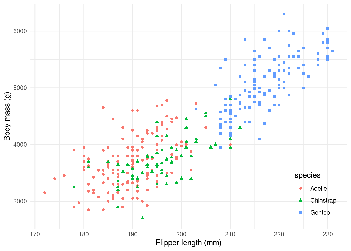
The plot looks like this:

There’s a bit going on in this dataset! What if we built it up one step at a time instead?
The key to seamlessly blending graphics is making sure they’re exactly the same size.
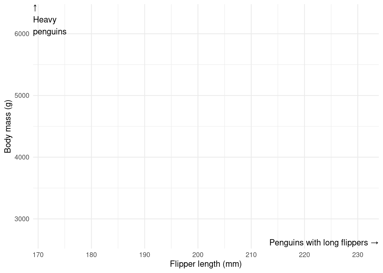
To start, let’s hide all of the data and add some explanatory text annotations.
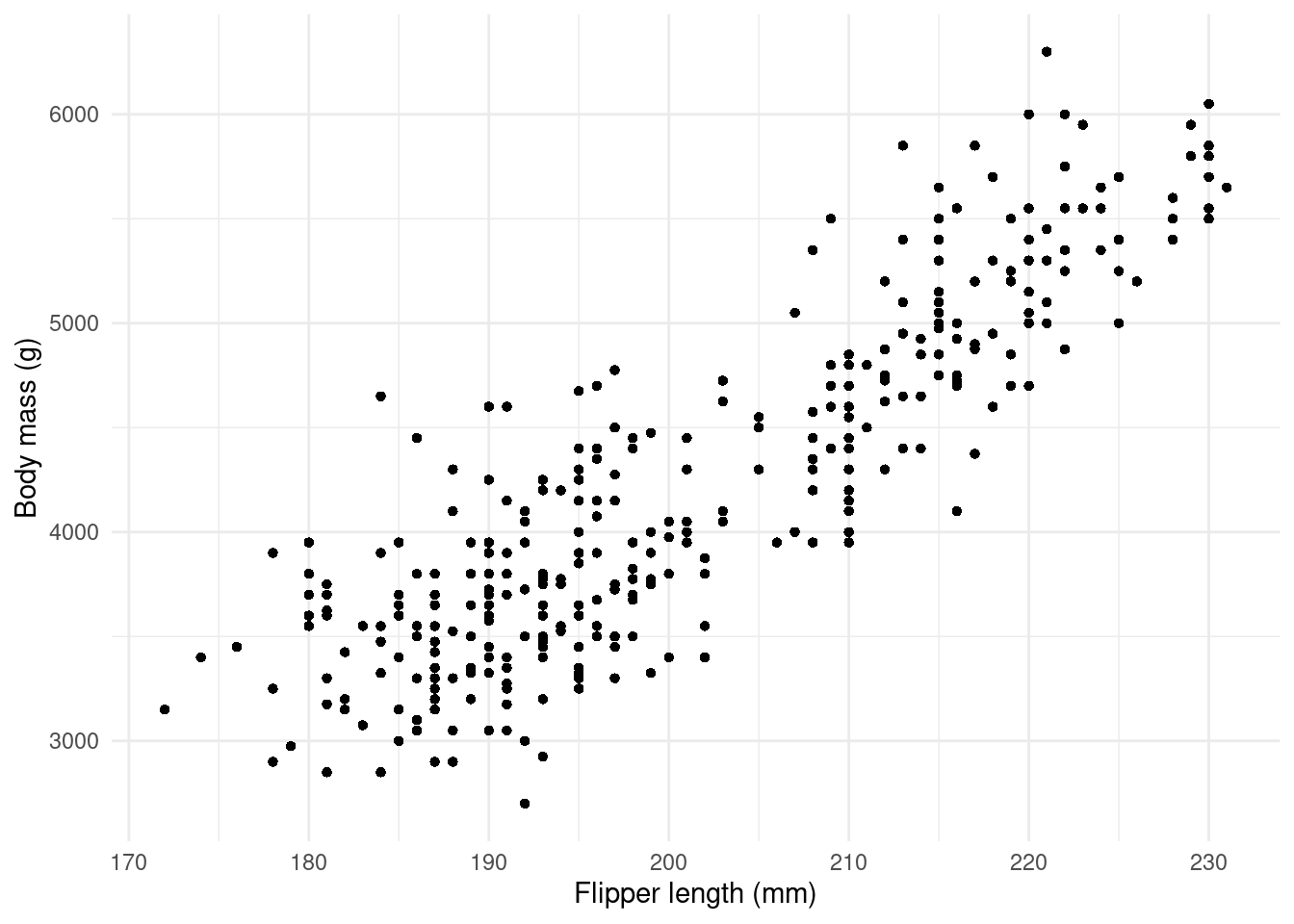
Now let’s reveal the data… but without talking about the species just yet.
We can already see that heavier penguins tend to have longer flippers.
By adding colour and shape, we can now move to our plot’s second message:
Some species are heavier and larger than others!


And there we have it!
There are a few things to keep in mind if you want a “built-up” plot to blend seamlessly.
When one plot replaces another, it’s crucial that things like your axes don’t move. By default, ggplot2 will calculate axes based on the data you’re plotting, so if your data changes - for example, because you’re not ready to show all of it - the axes will move, breaking the illusion.
One way to get around this to “pre-calculate” the domain of your axes and specify those limits (with xlim() and ylim() in ggplot2, or using the limits argument in a scale function).
Another way around it to include all of your plot layers in every step and to simply hide the ones you don’t want to show with zero opacity (in ggplot2, this is alpha = 0 argument, or providing a colour with zero opacity).
Your axes might also move because one step has a legend and another doesn’t - for example, when we show a step where all of the points are the same colour and shape.
Again, there are two ways around it. The easiest, which we’ve used, is to put the legend inside the plot space - that way, ggplot2 doesn’t reserve any space for it.
The other way is to still map colour and shape even for the step where you want all the points to be the same, but to use scale_[color/shape]_manual() to set all of the species to black circles. You may still want to manually hide your legend in this case.